Palmer Penguins Data Set
Data visualization of the Palmer Penguins data set using a scatter plot.
Reading in the Palmer Penguins Data Set
I will be creating a scatter plot from the Palmer Penguins data set. First, I need to import the pandas, matplotlib, and seaborn libraries.
#importing libraries
import pandas as pd
import matplotlib.pyplot as plt
import seaborn as sns

#using pandas to read in the Palmer Penguins data set
url = "https://raw.githubusercontent.com/PhilChodrow/PIC16B/master/datasets/palmer_penguins.csv"
penguins = pd.read_csv(url)
Next, I want to take a look at the data to see what columns I can use to create my scatter plot.
penguins.head()
| studyName | Sample Number | Species | Region | Island | Stage | Individual ID | Clutch Completion | Date Egg | Culmen Length (mm) | Culmen Depth (mm) | Flipper Length (mm) | Body Mass (g) | Sex | Delta 15 N (o/oo) | Delta 13 C (o/oo) | Comments | |
|---|---|---|---|---|---|---|---|---|---|---|---|---|---|---|---|---|---|
| 0 | PAL0708 | 1 | Adelie Penguin (Pygoscelis adeliae) | Anvers | Torgersen | Adult, 1 Egg Stage | N1A1 | Yes | 11/11/07 | 39.1 | 18.7 | 181.0 | 3750.0 | MALE | NaN | NaN | Not enough blood for isotopes. |
| 1 | PAL0708 | 2 | Adelie Penguin (Pygoscelis adeliae) | Anvers | Torgersen | Adult, 1 Egg Stage | N1A2 | Yes | 11/11/07 | 39.5 | 17.4 | 186.0 | 3800.0 | FEMALE | 8.94956 | -24.69454 | NaN |
| 2 | PAL0708 | 3 | Adelie Penguin (Pygoscelis adeliae) | Anvers | Torgersen | Adult, 1 Egg Stage | N2A1 | Yes | 11/16/07 | 40.3 | 18.0 | 195.0 | 3250.0 | FEMALE | 8.36821 | -25.33302 | NaN |
| 3 | PAL0708 | 4 | Adelie Penguin (Pygoscelis adeliae) | Anvers | Torgersen | Adult, 1 Egg Stage | N2A2 | Yes | 11/16/07 | NaN | NaN | NaN | NaN | NaN | NaN | NaN | Adult not sampled. |
| 4 | PAL0708 | 5 | Adelie Penguin (Pygoscelis adeliae) | Anvers | Torgersen | Adult, 1 Egg Stage | N3A1 | Yes | 11/16/07 | 36.7 | 19.3 | 193.0 | 3450.0 | FEMALE | 8.76651 | -25.32426 | NaN |
Selecting a Subset of Columns
I want to use the Culmen Length (mm), Culmen Depth (mm), Sex, Island, and Species columns from the data set to create my visualization. For this reason, I will select only these columns from the penguins data set and drop the NaN and ‘.’ values from these columns because these values are not helpful in my visualization. I also want to clean up the look of the Species column, so I will only use the first word in each of the Species’ names.
#select the appropriate columns and resave the penguins data set to only incorporate these columns
cols = ["Species", "Culmen Length (mm)", "Culmen Depth (mm)", "Sex", "Island"]
penguins = penguins[cols]

#drop the NaN values in these columns
penguins = penguins.dropna()

#drop the "." values in the Sex column
penguins = penguins[penguins["Sex"] != "."]

#edit each Species name to only include the first word
penguins["Species"] = penguins["Species"].str.split().str.get(0)
Creating the Plot
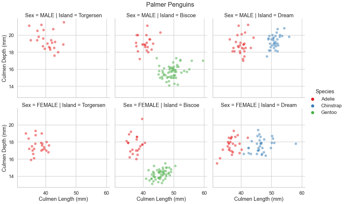
Next, I want to create the scatter plot using the seaborn package to display the Culmen Length and Culmen Depth for each penguin. I will use faceting to distinguish by Island and Sex. I also want to make each penguin’s data point a different color depending on their species.
#set the theme and color palette of the plot
sns.set(context = "talk", palette = "Set1", style = "whitegrid")

'''
create the plot with Culmen Length on the x-axis and Culmen Depth on the y-axis. each row of scatter plots
separated by Sex and each column separated by Island. the data points are different colors depending on the
species of the penguin.
'''
sns.relplot(data=penguins,
            x="Culmen Length (mm)",
            y="Culmen Depth (mm)",
            row = "Sex",
            col = "Island",
            hue = "Species",
            alpha=.5)

#add the overall title
plt.subplots_adjust(top=0.9)
plt.suptitle("Palmer Penguins")

plt.show()